Creating Accessible Packaging
This guide covers the principles, practices, and metrics used to bring inclusive design to product packaging.

Announcing: Accessible Packaging Toolkit
In addition to the Guidebook, which you can read below or download from the link above, we are making available an Accessible Packaging Toolkit. The Toolkit includes practical, hands-on guidance to the structural and graphic elements that go into making accessible packaging at Microsoft. The Toolkit is intended to be a quick reference for designers and makers.
Introduction
What follows is imperfect. Even though we’ve been on this journey for some time, we continue to learn. One of the most important things we’ve learned is that when it comes to creating products for everybody, you need to include everybody.
Everyone we’ve met has taught us something. This document is the output of a group of humans who want to make better products for every person in the world. We are sharing it in the hope that we can continue the learning journey along with everyone who reads it.
— Packaging & Content Team, Microsoft
Who is this guide for
This guide is for anyone who is interested in inclusive design and accessibility where it comes to life in the real world of product packaging. Designing with all people in mind is challenging, humbling, and deeply rewarding. Whether you are just starting the journey, or whether you have been incorporating inclusive design for a long time, this guide was created to help. On the Microsoft Packaging and Content team, we’ve been thinking hard about this for a while, and along the way we have learned a bit. This guide was created to help share the principles and insights we have gathered.
It is our hope that some of our recommendations can be useful to designers and other packaging professionals and can help spark conversation. A lot of the ideas in this guide come from our firsthand experiences, and a lot of it is leveraged from existing resources and frameworks, including the Microsoft Inclusive Design Toolkit, refocused through the lens of packaging.
“When it comes to creating accessible products and packaging…we all win.”
This guide is not intended to be definitive or all-encompassing. It is the work of a specific team of designers who develop packaging for a specific set of products in the tech and gaming industries. We hope, however, that the examples, tips, insights and learnings provided, when creatively interpreted and applied, can anchor any inclusive packaging efforts, regardless of product type. Thank you in advance for taking an interest, because when it comes to creating accessible products and packaging that make as many people as possible part of our product making, we all win.
Who we are
The Packaging and Content Team at Microsoft is a team of designers, engineers, developers, program managers, and localization experts nestled inside of one of the largest, most dynamic companies in the world. It is our privilege to work on products that reach millions of people around the world. We’re passionate about bringing the Microsoft product experience to life through packaging in the most sustainable and accessible ways possible.
One of the advantages of being part of such a large company is that we get to leverage the larger accessibility initiatives and commitments of the company as a whole. We are very grateful to be part of a company that prioritizes inclusion and access as a necessary step to “empower every person and organization on the planet to achieve more.”

Why does it matter
Here are some numbers to refer to when someone asks why packaging accessibility should be taken seriously.
1.3 billion people, or 16% of the world’s population, experience significant disability. When you look at the adult population, the figure is closer to 1 in 4 (27%). At some point in our lives, we will all experience or be impacted by disability— whether permanent such as the loss of a limb, or temporary such as breaking a bone which limits our mobility, or situational such as carrying a baby. When you factor in temporary and situational disabilities along with permanent ones, as many as 83% of us will experience disability while of working age.
The disability community commands $500 billion in disposable income in the US and $1.2 trillion globally. When you include family and close friends of disabled individuals, the number reaches $6.9 trillion. Companies that improve the accessibility of their products see a 28% increase in revenue. 72% of consumers said they would switch brands if a product/package was demonstrably more accessible. By the numbers, inclusive design expands the market for your product.
A few more reasons to make creating accessible packaging a priority.
Inclusive design drives innovation that improves the experience for all customers, not just those with disabilities. Accessibility is already the subject of many laws and regulations, such as the Americans with Disabilities Act (ADA), but new rules, such as the European Accessibility Act which goes into effect in 2025, address packaging directly. Proactively addressing accessibility can help companies stay in line with new regulations and avoid potential lawsuits, fines, and reputational damage from non-compliance.
As the overall population shifts demographically older, more and more people will need products and packaging designed to accommodate the challenges of old age. And lastly: Design that includes everyone just makes people’s lives better.
“Accessibility is the right thing to do. And not just the right thing; it’s profoundly the right thing to do, “ because the one argument for accessibility that doesn’t get made nearly often enough is how extraordinarily better it makes some people’s lives. How many opportunities do we have to dramatically improve people’s lives just by doing our job a little better? ”
— Steve Krug, Author of Don’t Make Me Think
Join us, help us
This guide should be considered a work in progress. It is our intention that later editions will incorporate the lessons we continue to gather as we progress on our accessibility journey. We also hope that future editions will include the shared insights gleaned in conversation with you, our readers.
We would love to hear your thoughts and ideas about this guide specifically and also about accessible packaging in general. Please send us your feedback at AccessiblePackaging@microsoft.com.
We look forward to having conversations with you.
Fundamentals
“We celebrate and support the more than 1 billion people with disabilities. Inclusion leads to innovation, and we're committed to building tools that are accessible to everyone and help create a more equitable future.”
— Satya Nadella
Unexpected beginnings
Prior to 2018, the Packaging and Content Team at Microsoft defined packaging success in terms that might have felt pretty familiar for a company building consumer electronics experiences:
- Protect the product (naturally)
- Embody the brand
- Curate the unboxing experience
- Pay attention to the details and be rigorous about the quality of execution
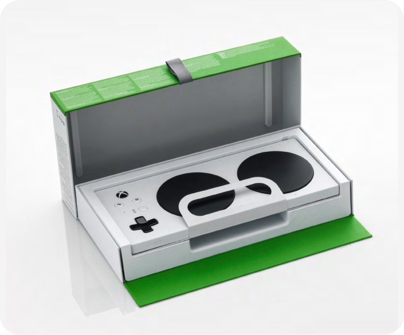
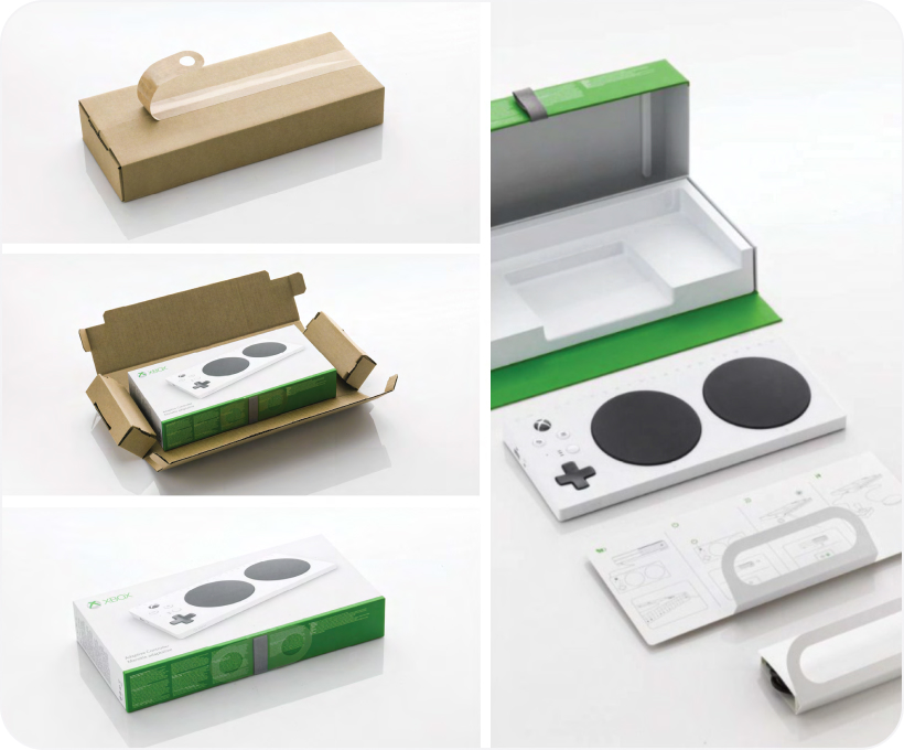
At every step, of course, we needed to consider the business and cost implications of our decisions. Make no mistake: this by itself is a tall order. A lot goes into delivering well-crafted, efficient, and engaging packaging for one of the biggest brands in the world. And then Xbox created the Adaptive Controller.
The Xbox Adaptive Controller (XAC), which started as an internal hackathon project, allows gamers with limited mobility to connect switches, buttons, mounts, and joysticks to create a custom experience that meets their needs better than a standard controller. It helps open the door to gaming for people who might otherwise be excluded.
With the development of the XAC, we realized that our existing approach, principles, and norms of packaging success needed to adapt. How could we package such an inclusive product without attempting to make the package as accessible as the controller itself? We needed to relook at our definitions of success.
Inclusive design and accessibility
We knew that if we wanted to make our packaging more accessible, we would need to start with inclusive design. Inclusive design is a methodology that considers the full diversity of human experience and abilities to ensure that as many users as possible can enjoy an equitable experience. The success of inclusive design stems from including and learning from all people and incorporating a range of perspectives into our work.
The best way to think of the relationship between inclusive design and accessibility is that inclusive design is a method and accessibility is an attribute. Practicing inclusive design does not guarantee that your final design will be accessible, but when done deliberately, with openness and curiosity, it is the best chance to achieve equitable access for users of all abilities.
Starting from principles
At Microsoft we have three foundational Principles for Inclusive Design:
- Recognize exclusion
- Learn from diversity
- Solve for one, extend to many


Recognize exclusion
Inclusion is an active choice. If we’re not purposefully being inclusive as we create experiences, we will be exclusionary, intentionally or not. Exclusion happens when we design using only our own experiences and biases as measures.
Disability should not be thought of as a personal health condition, but as a mismatch between a person and their environment. As such, disability is designed. As builders, it is our job to identify mismatches and to generate new ideas and new designs. Points of exclusion, once identified, are opportunities to generate solutions with utility and elegance.
“If you aren’t building accessibility in, you are probably building it out”
— Jenny Lay-Flurrie Microsoft Chief Accessibility Officer
Learn from diversity
Inclusive design puts people in the center of the process. It is crucial that design efforts include the people being designed for from the beginning. Members of the disability community are the real subject matter experts. Tapping into these unique and fresh perspectives is the key to true insight.
No amount of simulation or empathy exercises will substitute for engaging with the community directly.
Learning how people with disabilities adapt to the world around them means spending time understanding their experience through direct conversation.
Solve for one, extend to many
Everyone has abilities, and limits to those abilities, yet there are universal ways human beings experience the world. Designing for people with permanent disabilities can seem like a significant constraint, but the resulting designs can benefit a much larger number of people. For example, a device designed for a person who has one arm could be used just as effectively by a person with a temporary wrist injury or a new parent holding an infant.
The needs of disabled users, while sometimes more pronounced, aren’t fundamentally different from the needs and preferences of other users. For example, low-vision users have a more pressing need for eye-friendly fonts, but easy to read text is appreciated by everyone. Effective designers recognize beauty in constraints. Designing under constraints is a great way to challenge ourselves to create experiences that transcend one set of circumstances and benefit many in the process.
Inclusive design in practice
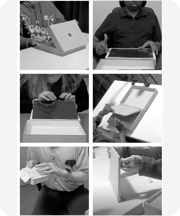
Co-designing
One of the ways that Microsoft’s inclusive design principles come to life in practice is in the idea of co-designing. Co-designing is more than just running user tests or surveying customer preferences. It is the recognition that members of the disability community are the true experts and that they need to be involved in the design process from the very beginning. A motto that is common in the disability community, “Nothing about us without us,” captures the idea that people with disabilities understand their own needs the best. Solutions designed on their behalf, without their input, will likely fail or miss the mark.
This does not mean that the role of the designer is to be a passive listener. People with disabilities have the keenest understanding of the barriers they face, yet they might not always be aware of the solutions or designs that can help overcome those barriers. The designer’s role is to bring design thinking to the challenges that people with disabilities face and propose, test, ideate, and refine solutions in collaboration with the community.
Inclusive design sprints
A big part of the co-designing process involves inclusive design sprints. There’s great power in designing an experience with your customer, not just for your customer. Creating with the disabled community taps a critical wellspring of knowledge, insight, and partnership. An inclusive design sprint offers designers, engineers, marketing, and planning folks the opportunity to engage with a group of subject matter experts who are uniquely invested in the success of your product.
This interaction allows the team to immerse themselves in specific challenges, ask questions, and experiment in real-time. Inclusive design sprints aren’t training but an integral part of our development process. Early engagement is critical.
Inclusive design sprint approach
The following is an outline for running inclusive packaging design sprints that has proven successful for our team.
Find the Communities.
You can’t design inclusively in a vacuum. Seek out members of the disability community, whether internal to your company or externally. There are many organizations that can assist teams wanting to create more accessible experiences.
Learn from the subject matter experts (SMEs).
We’ll bring in people who have barriers to interacting with our packaging so they can describe their needs and the challenges they face. They often interact with work-in- progress, or share their experiences about past packaging interactions, successful or otherwise. The goal is to capture research and input insights that will inform ideation.
Partner with aligned stakeholders.
Designers are not the only ones who can learn from listening to the community.
Include as many people as possible from other disciplines including engineering, marketing, and product developers. This way varied perspectives are represented and participants can bring the information back to their teams.
Set aside the time.
Duration can vary greatly, depending on the work under development. We’ve run sprints lasting a few hours to a couple of days. Each sprint is tailor-designed and scheduled based on the group’s needs. Having stakeholders and SMEs commit to the full sprint duration is key to making the most of your sprint and maximizing learning.
Start early.
Run the sprints early, preferably at the very start of the process, not right before shipping, when it is too late to make changes.
Be aware of context.
The testing environment should mimic real life scenarios and not a lab.
Stay open.
Inclusive design sprints require an extra level of humility and openness born from the realization that we are not the experts. Listening is the first step. Solutioning and problem solving must wait for the full understanding of the problem.
Schedule integration.
Making inclusive design sprints an ongoing part of your development process is necessary for making meaningful progress. Having milestones in your schedule can help manage the challenges of time and resource limitations, and foster organizational commitment to the benefits of such sprints.
Ideate rapidly and repeat.
Sprints provide the opportunity to try different solutions and adjust quickly in real time. Don’t expect the first proposal to hit the mark.
Accessible packaging principles
Accessible packaging design principles
Over the course of several years, we have crafted a set of packaging-specific principles that have served as guideposts for our work. These principles level-set inclusive product making at Microsoft and help shape experiences end-to-end. Business and product requirements change rapidly in our world, so having clear, tested principles helps steer our creative process and ensure cohesion across outputs and functions.
Beyond representing an aligned disciplinary framework, they act as a “North Star” no matter what we’re trying to achieve.
The following accessible packaging principles have emerged from our observations and experiences running inclusive design sprints. They include learnings from our successes and not a small number of failures. Our principles aren’t static; they live and evolve. We continually revisit our assumptions, but the following represent a set of our most well-used and leverageable principles to date.
Simple is best
More simple steps are easier than fewer complicated steps. For years, as packaging designers we held fast to a “three steps to product” rule as a cornerstone of success. But the reality is that complicated, intricate steps – even if there are fewer of them – are less accessible to many with disabilities than simpler, less complex steps. Our challenge is to focus on creating a seamless, simple series of steps that don’t inadvertently assume ability, overcomplicate physical, or cognitive needs, and leave customers behind.
Identifiable elements
Create package characteristics or elements that are easily identifiable, intuitive to understand, and seamless to use. Creating direct and easy to understand physical and visual cues that assist our customers in unboxing is a sign of respect and a hallmark of good design. Creating a meaningful balance between instruction and experience enhances functionality for diverse abilities.
Materials matter
Be mindful of material selection and quality as users often leverage improvised means of opening. People are incredibly inventive, and when confronted with a package that is less than accessible, users with disabilities often improvise. Don’t take for granted that all users have the same level of physical sensitivity or dexterity. Choosing materials that are user- friendly and reduce the risk of injury without compromising functionality or overall experience creates opportunities for all.
Ready access
Multiple product access points are beneficial. People want to engage with products on their own terms. Traditionally, designers try to guide users through a series of predetermined steps to access a product. Designing inclusively means doing the opposite; success often lies in creating as many paths to a product as a package might allow, thereby allowing individuals to determine the best way for them to engage and evacuate. If possible, create multiple paths to product.
Reduce pivot points
Reduced number of pivot points per interaction is more user-friendly than multiple motions. Keeping physical movement to a minimum, while maintaining effective out-of-box experience (OOBE) is ultimately more inclusive than requiring varied and multiple actions or postures, be they lift, pull, push, rotate, etc. The fewer axes of movement, the better, as it lowers the number of barriers for more people, regardless of ability.
Low physical effort
Prioritize features that are efficient, comfortable and can be used with minimum strength. People vary in size, shape, preferences and abilities. Creating packaging attributes that are comfortable to use and require a minimum of physical strength to activate automatically provides greater access to product experiences than those requiring a higher bar of physical engagement. Ensuring maximum efficiency and use- case ease is a great way to foster comfort, productivity, and safety for a wide range of people.
Size, space, stability
Maximize the product-to-package relationship and ensure size and space is provided for approach, reach and manipulation regardless of body size, posture or mobility. Be mindful of how products are contained and displayed in-box. While we must protect our products, create opportunities for people of various abilities to easily access and evacuate a product, while fostering a sense of empowerment and ease. Consider all elemental relationships as force-multipliers: product weight, package height, negative space, cavity depth, integrated, or additive attributes, etc.
Mindful moments
Physical and visual moments should be unmistakable in intent and lead the user to the next logical step in their journey. The mindful integration of physical and visual packaging moments is often what lands inclusive intent. Inclusive design forms and features must be considered holistically and in tandem with each other. Disconnection between three-dimensional and two-dimensional elements not only diminishes the overall experience but runs the risk of creating unnecessary barriers to use and understanding.
No tools needed
Design straightforward packaging that performs without the need for tools or external instruments. Embracing accessibility through innovation is something we strive for. Our approach is to design straightforward packaging that performs without the need for tools and that doesn’t force the user into an unsafe interaction, such as opening with the teeth. Inclusive design shapes forms to fit individuals, not the other way around. Purpose-built packaging forms that fit individuals (without additional support) while enhancing the overall function as designed is our priority.
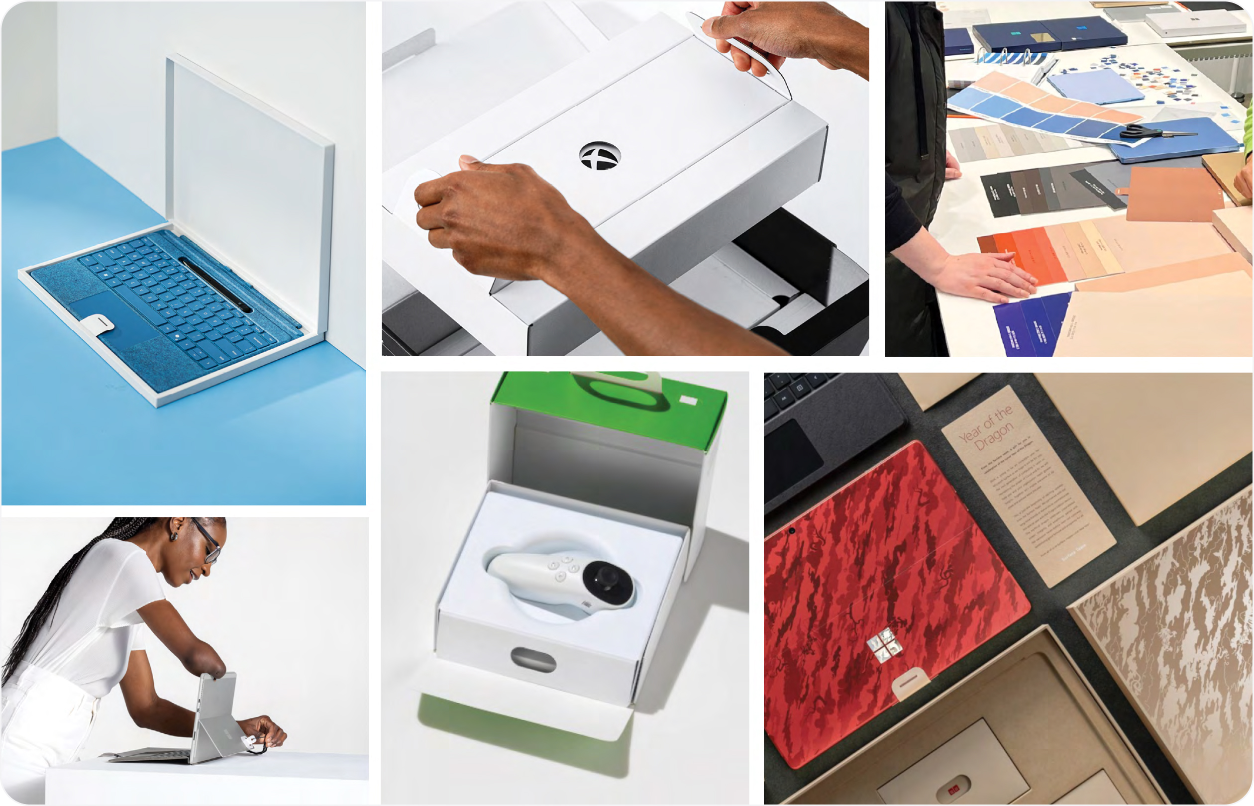
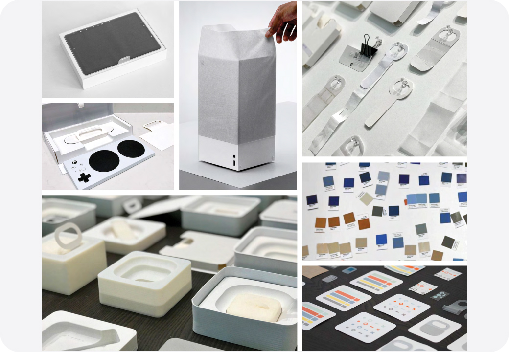
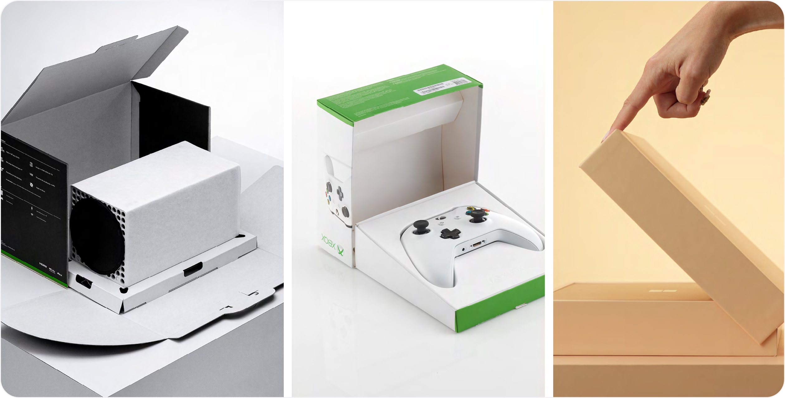
Accessible packaging elements
Bringing accessible packaging to life
There are many ways to bring inclusive design thinking to life.
We’ve shared some of our fundamental building blocks (i.e. methodology, principles, the importance of user testing, etc.) but where experiences really take root is in the design, development, and execution of accessible elements. Packaging elements and features deliver on many fronts. They need to perform functionally, aesthetically, and experientially. They need to meet cost requirements and must be sustainable, too.
Accessible elements often require a rethinking of traditional packaging norms and can be an exciting playscape for reinvention. Here we share some of our most successful and widely deployed accessible packaging elements across our portfolio.
The importance of moments
We believe a successful out-of-box- experience (OOBE) is the culmination of curated touchpoints, intuitive wayfinding and clear intent. In short, the sum-total of the moments your customers encounter as they unbox their product. Accessible elements play a role in delivering an integrated experience. Certain moments are more important than others and having a clear understanding of key opportunities to assist in unboxing is helpful to charting a meaningful OOBE.
Be strategic about which moments you focus on. Decide what elements deliver the most accessible impact (e.g. a tab, loop, or channel) and lean into those. Be inventive and stretch your imagination.
Platform consistency
We approach our work holistically. When we design a package, we not only consider the product and its needs, but the implications of our decision-making across the complete portfolio.In fact, we try to see the potential of what we create across our entire ecosystem of products, regardless of product line or channel. Whether we’re creating packaging for Surface or Xbox or the Next Big Thing, we strive for accessible structural and visual elemental consistency.
Our system is a scalable one, by design. Sometimes an element needs to change slightly due to product or material parameters. In these instances, we evaluate the feature on a program-by-program basis and innovate accordingly. Maintaining consistency is important to us. Though this is our approach to portfolio stewardship, there are many ways of assessing and implementing accessible opportunities.
Accessible packaging elements
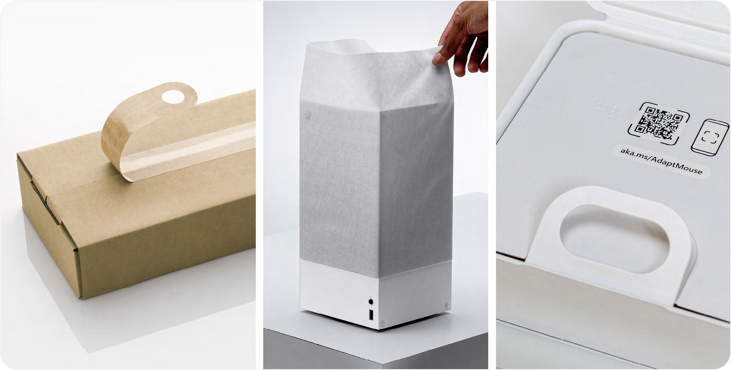
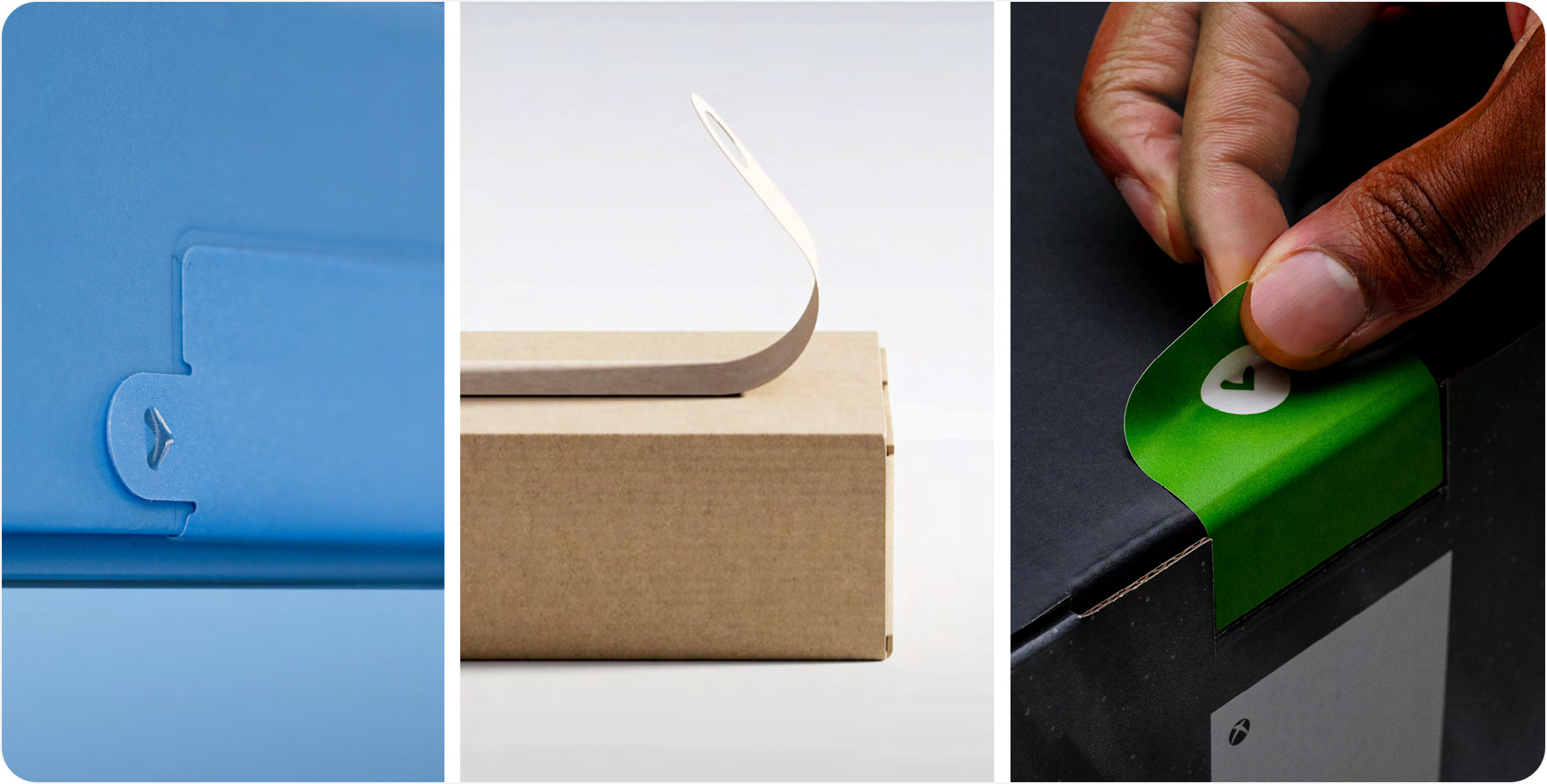
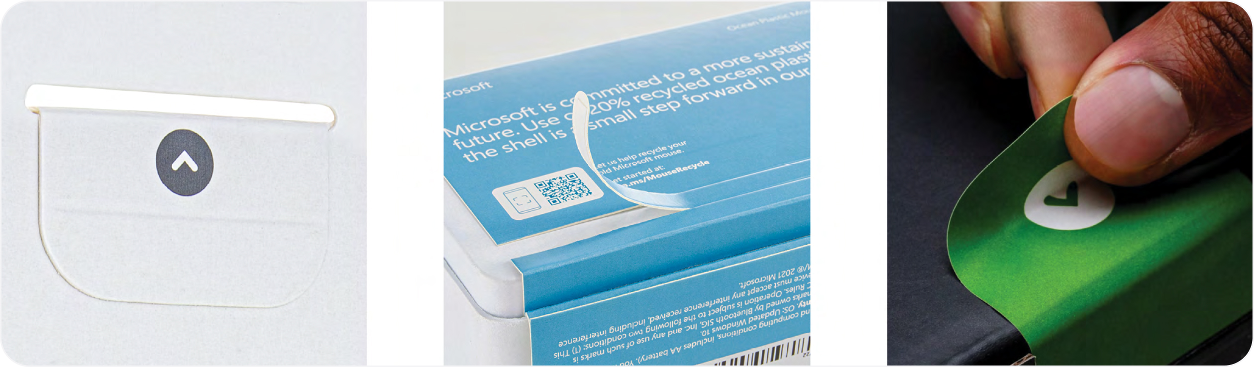
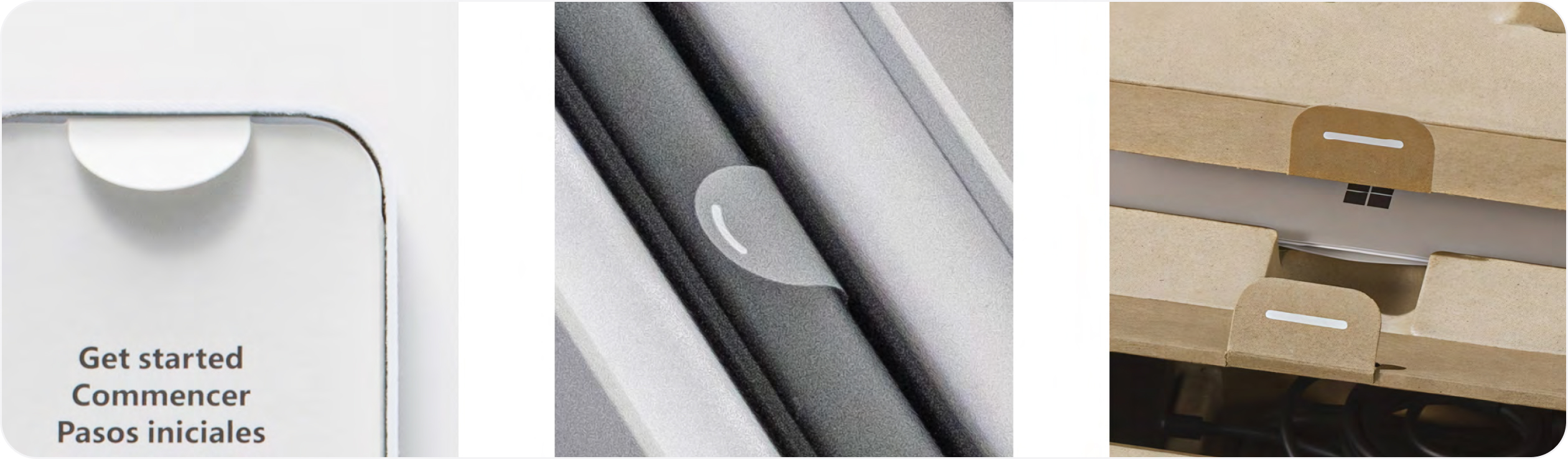
Outer box seals
Whether the element is a “break the seal” (BTS) label or shipper tape, it is important that we make removing these security seals accessible as this is often the first moment of an unboxing experience.
Closures that seal packaging can often pose challenges for customers as they attempt to peel or remove them. To address this, we’ve used large BTS tabs, shipper tape with loops, and integrated tab with graphic cues and purchase to assist with opening.
We’ve also designed integrated tear strips as part of the primary package that universally activate from the left or right. The pull-tab is designed to give more purchase and assist in removal. Ensure seals are discoverable through visual and tactile means.
Helpful hints
- Ease of discoverability of an outer box seal is key to ease of use. Don’t hide it, celebrate it.
- Include graphic arrows and tactile elements as wayfinding cues to assist customers in locating and activating outer box labels or shipper tape.
- Provide leverage points for seal removal, such as a protruding pull tab.
- Don’t apply adhesives on components that don’t need them.
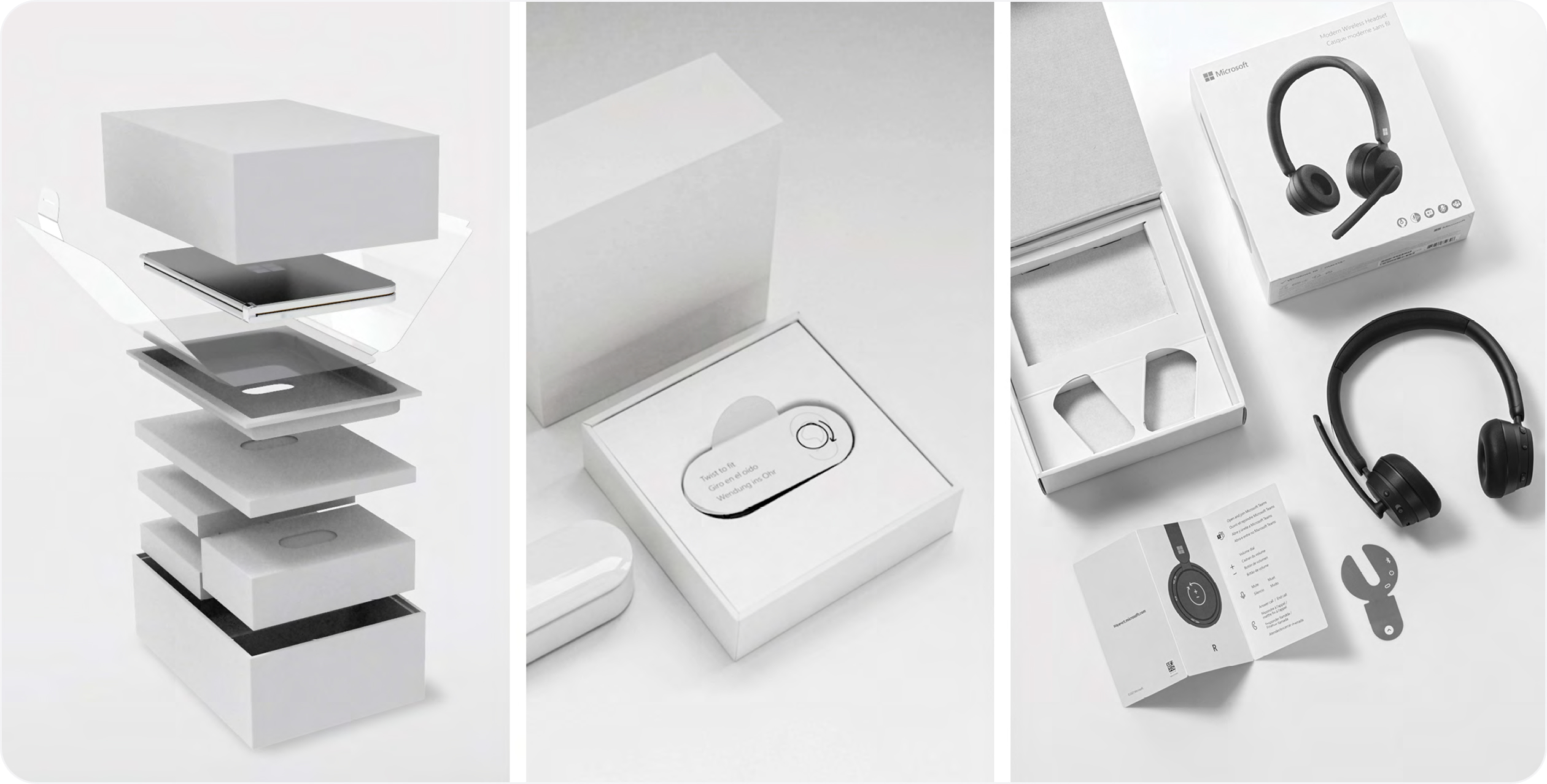
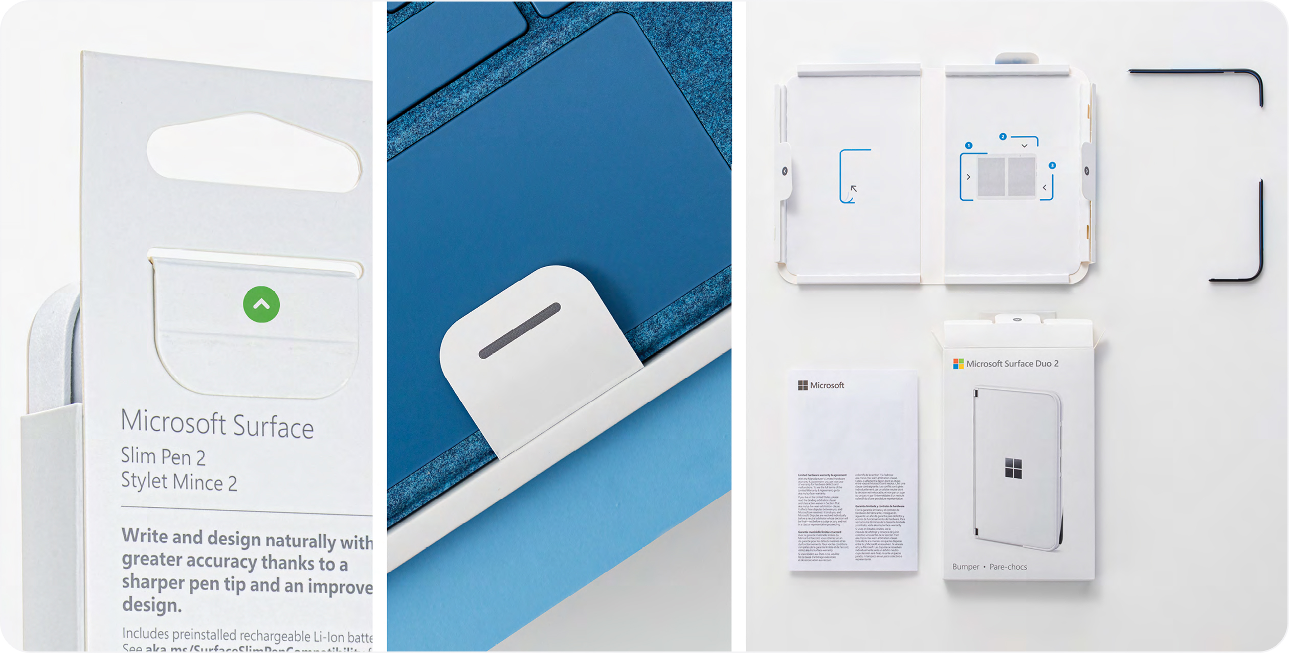
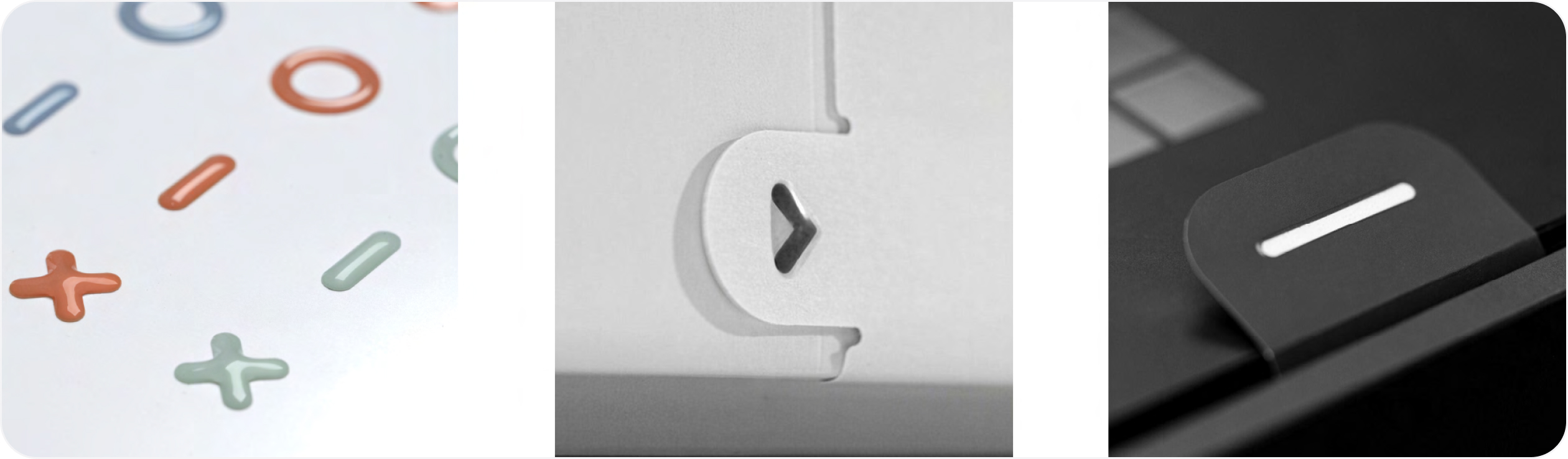
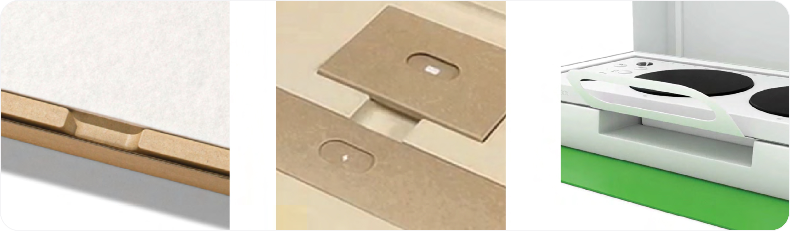
Tabs
Tabs provide leverage points and graspable areas which assist with product evacuation, label removal, and packaging element separation (such as folios or accessories). We integrate tabs into almost every element on our packaging, including product wraps, protective labels, document folios, accessory compartments, and battery pull tabs. To be most useful, tabs should be highly visible to attract customer attention and cue action.
Generously proportioned tabs provide the most opportunity for grasping and leverage. Simple dashes can be used to communicate interaction, but smaller areas, like battery tab labels, may need heightened awareness. In these instances, we add a knocked-out arrow for heightened visibility, and to call attention to the element.
Helpful hints
- Graphic elements become a shorthand for customers, so think carefully and deploy consistently across physical touchpoints to reinforce your intent and avoid confusion over time.
- Tabs not only need to be discoverable and easily understood but functionally perform. Choose materials for strength and durability and test rigorously.
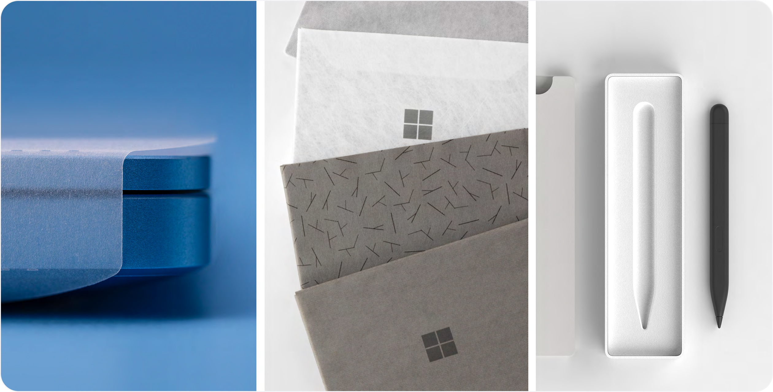
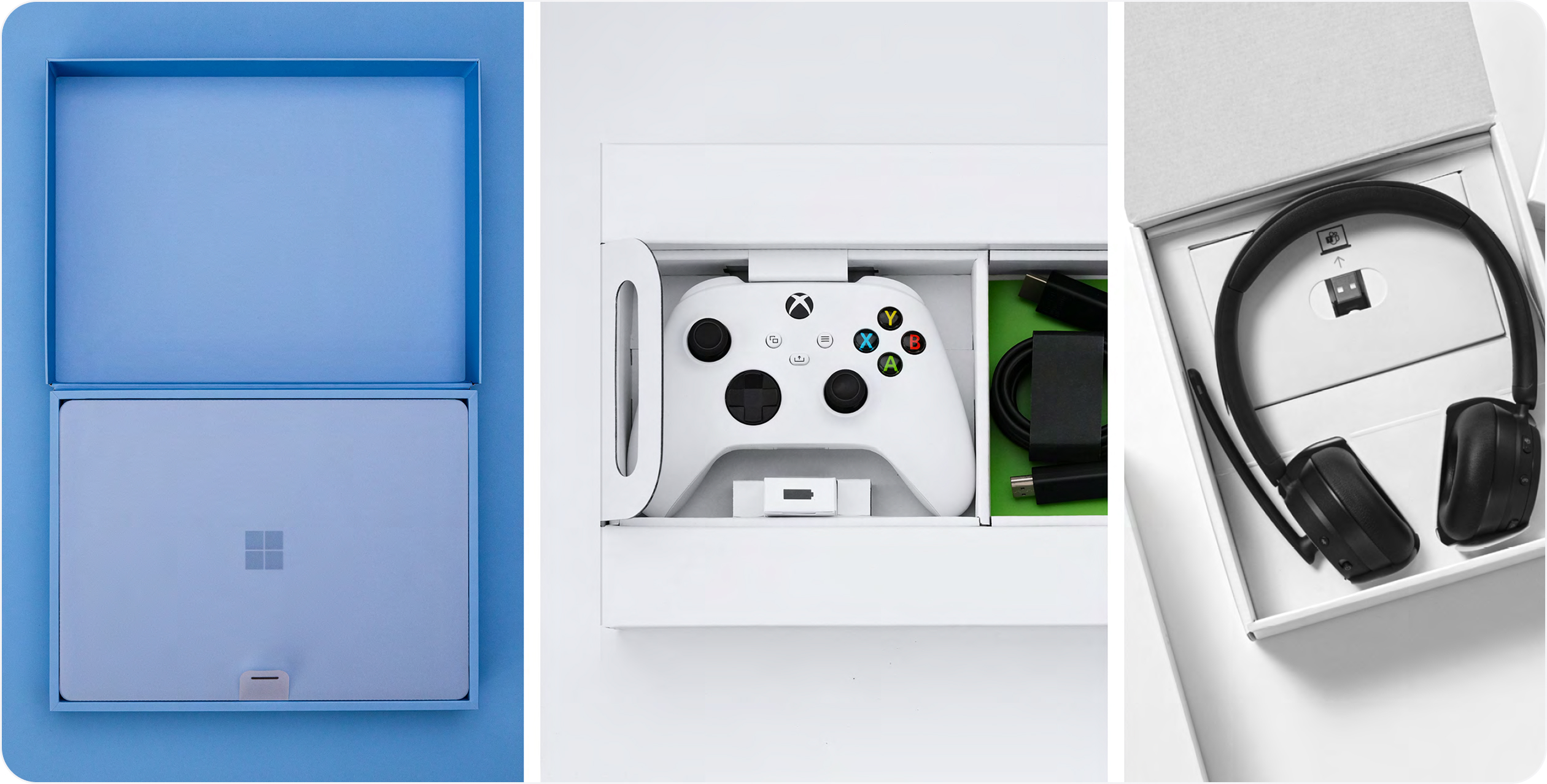
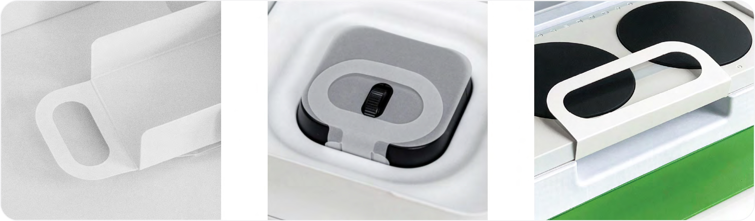
Loops
The nature of a loop design allows customers to engage with it in a variety of personal ways and therefore makes it a supremely agile component. A loop’s flexibility and user-centric attributes, combined with the fact that it can be executed in multiple substrates, makes it useful under diverse packaging circumstances.
Size. Loops have user and performance limits. Small loops can be frustrating. Wide loops can be weak.
If the element is diminutive or proportionally excessive, then perhaps a solid tab is better suited to the job.
Strength. Loops are only successful if they perform well. Loops that break or tear don’t deliver on the intent, so make sure they’re structurally sound.
Material selection. Loops are a high-touch element, and materials need to be carefully considered to deliver a pleasing and safe experience.
Access. This might sound obvious, but loops are best deployed where customers can freely access them. They need a bit of space to deliver on their benefits.
Helpful hints
- We’re big believers in the design principle of “concentricity”. When creating loops, we ensure a concentric relationship between the outer loop and inner cavity, to maintain visual balance, elemental consistency, and structural integrity.
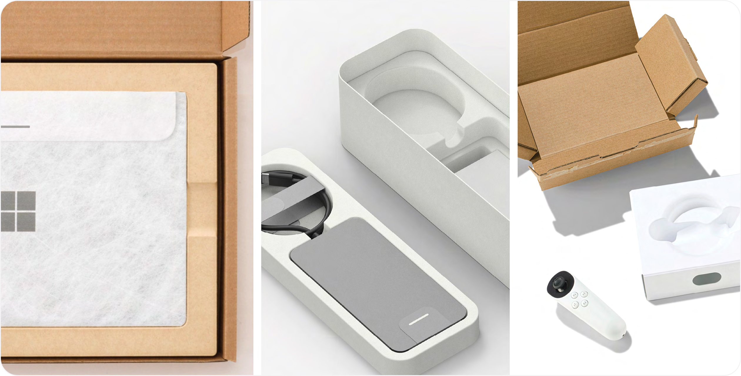
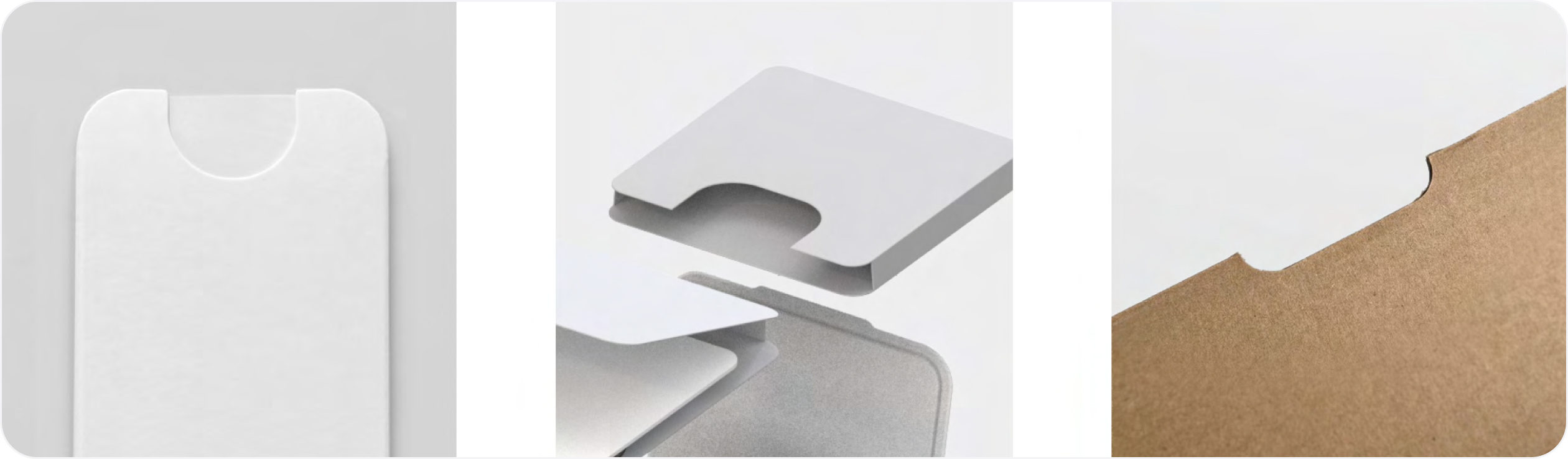
Die cuts and notches
Our packaging often consists of smaller, in-box packaging components, such as accessory boxes, folios, etc. These smaller components can contain power supply units, cables, ancillary products, and printed content. In-box components not only need to be secure and protective, but also easily evacuated and accessible. Die cuts and notches can be a great accessible element in such scenarios. Die cuts in particular are simple and user intuitive. When generously proportioned, they provide means of egress for components, while allowing a focal point for iconography or other graphic cues.
Helpful hints
- It’s important to aim for consistent size when it comes to large, medium, or small cavities or notches. There may be cases where size needs to change based on parameters or proximity to box edges, but ample proportion should always be maintained if possible.
- We love creating visual consistency across our portfolio. The shape and radii of physical elements like die cuts can be an opportunity to mirror graphically elsewhere in the customer journey.

Tactility
On our graphic wayfinding cues, such as arrows on BTS labels or dashes on tabs, we make a point of adding tactile detailing. This might seem like an overly nuanced detail, but it’s not. The power of tactility and physical texture to assist users with limited mobility, reduced physical sensitivity, or low vision, can’t be overstated. When executed on high-touch, critical out-of-box moments, tactility makes a difference.
Tactility improves user experience by reinforcing calls to action and providing breadcrumbs to lead customers through unboxing using the sense of touch. Tactility helps users with limited vision orient themselves to functional elements as they navigate a package. It brings graphic cues into three- dimensional relief and provides augmented information. Tactility also adds friction to increase dexterity at key moments of physical interaction. Texture enhances otherwise smooth substrates, providing traction, grip, and leverage where needed.
Helpful hints
- Tactile details do not require the use of plastics. We emboss, use UV layers, or a combination of the two to deliver on the feature. Accessible detailing can be sustainable, too.
Feature iconography
Icons go a long way towards democratizing critical content and quickly delivering key information.
For many people, icons can be processed by the brain more easily than text, which can be especially helpful for people with dyslexia or other learning disabilities. A single bold icon will be easier to perceive than multiple words for people with limited vision.
We have created a curated, scalable set of icons that can be used on device wraps, package, product labels, accessory box cards, assistive tabs, and our quick start guides.
Helpful hints
- Do your due diligence. There are lots of ways to test and validate iconographic design intent, inexpensively and quickly. Stress test your assumptions with partners, users, and customers before deploying.
- When possible, leverage existing symbols that have a clear, established meaning, (e.g. the power button symbol) rather than trying to invent new symbols.
- If space allows, include both icons and text to reduce the risk of misinterpretation and support diverse learning preferences.
Wayfinding iconography
Iconography can be a powerful, flexible, and inclusive way to communicate. When carefully designed and applied, icons allow customers to navigate their unboxing experience and quickly discover device features, components within boxes and better understand useful product information without the barrier of language or translation. Consistency across product lines and packaging formats further deliver a consistent and seamless customer journey.
Helpful hints
- Contrast is key. To be inclusive, iconography must have an adequate contrast ratio. And don’t be tempted to believe that adequate contrast means a less premium experience. Well-crafted premium experiences are beautiful and inclusive.
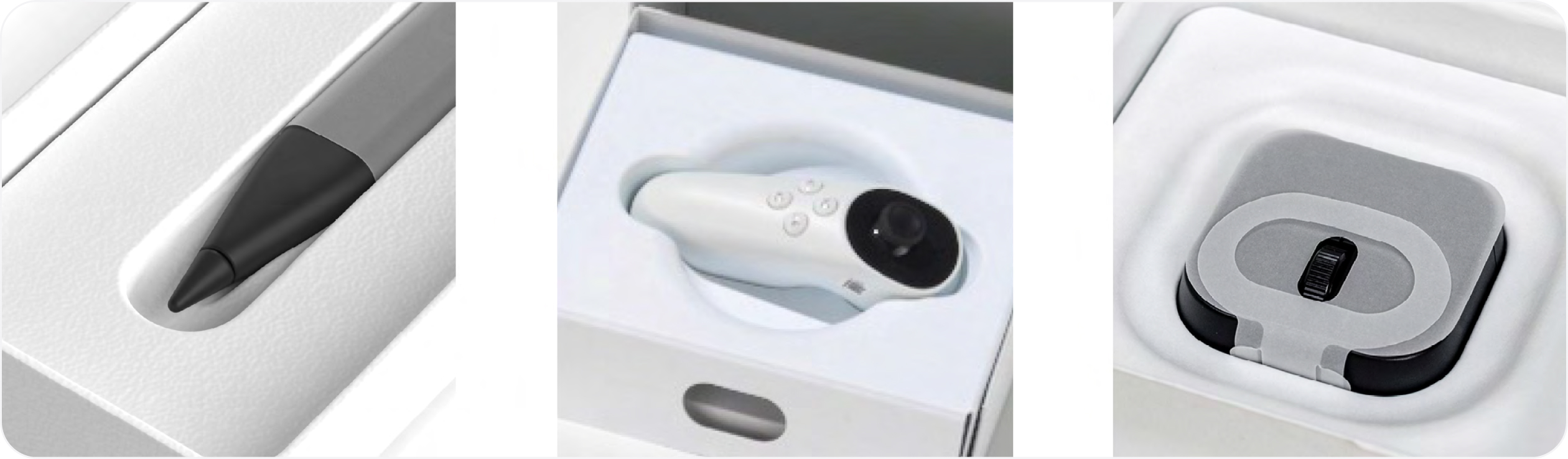
Channels and cavities
When tabs or loops aren’t an effective option due to product size or material limitations, we opt for channels and cavities. Channels and cavities can be useful as they allow a customer to get under or around a product. This can be helpful if the action of lifting or pinching an element (such as a tab) is difficult. It creates space and another path-to-product. All packaging components, including tabs and loops, will be adapted by users to fit their unique needs. Open space like cavities allows the greatest opportunity for creative adaptation.
Creating channels, cavities, or other useful “negative space” around a product takes not only a designer’s eye to appear intentional but also testing and qualification to ensure the integrity of the packaging component hasn’t been compromised. Materials are an important consideration when designing for negative space. Some materials, such as pulp, are more moldable and provide more flexibility and design options. Channels or cavities (by nature) result in material reduction, thereby possibly making the component more sustainable.
Helpful hints
- Try to strike a balance between material efficiency and access to product features. Be mindful of proportion and product-to-package ratio for optimal results.
Braille
Braille on packaging can play a crucial role in making products more accessible as it allows visually impaired customers to identify products and access important information. In the past, we’ve used braille to label QR codes on some of our PC Accessory and Adaptive Accessory packaging. Even for blind and low- vision customers who don’t read braille, the raised dots provide a tactile signal that there’s information worth exploring in the area. To be open, you won’t find braille on all of our packaging. We are still exploring the most effective ways to make use of this tool.
Material
Braille is commonly placed on packaging by embossing it directly on the packaging material. The same tool that cuts and creases the substrate can often add the emboss in the same pass which allows braille to be added without significantly increasing cost. Thinner carton board generally takes embossing well. Materials that can’t be embossed (e.g. thicker corrugate boxes) may require adding the braille as an attached label or as an additive process such as spot UV.
Specifications
There are many specifications for setting braille type. The Braille Authority of North America was useful to us in understanding how best to implement braille on our packaging.
Localization.
Different countries have slightly different codes for braille. Though the letters a-z are largely standard across countries, numbers, punctuation and special symbols vary. Unified English Braille (EBU) Code and EBU European Braille Code have been developed to help standardize across regions.
Helpful hints
- Our user research validates that an optimal readability target height for braille on a package is 0.4 to 0.5mm. However, we have had success with 0.2mm (though this is less than recommended).
- Unlike text, which can vary in size and format, braille dot size (1.5mm) and spacing (2.4mm) do not vary regardless of packaging size and shape.
- Following box orientation, braille should always read from left to right.
- Consistent on-box location will assist in discovery.
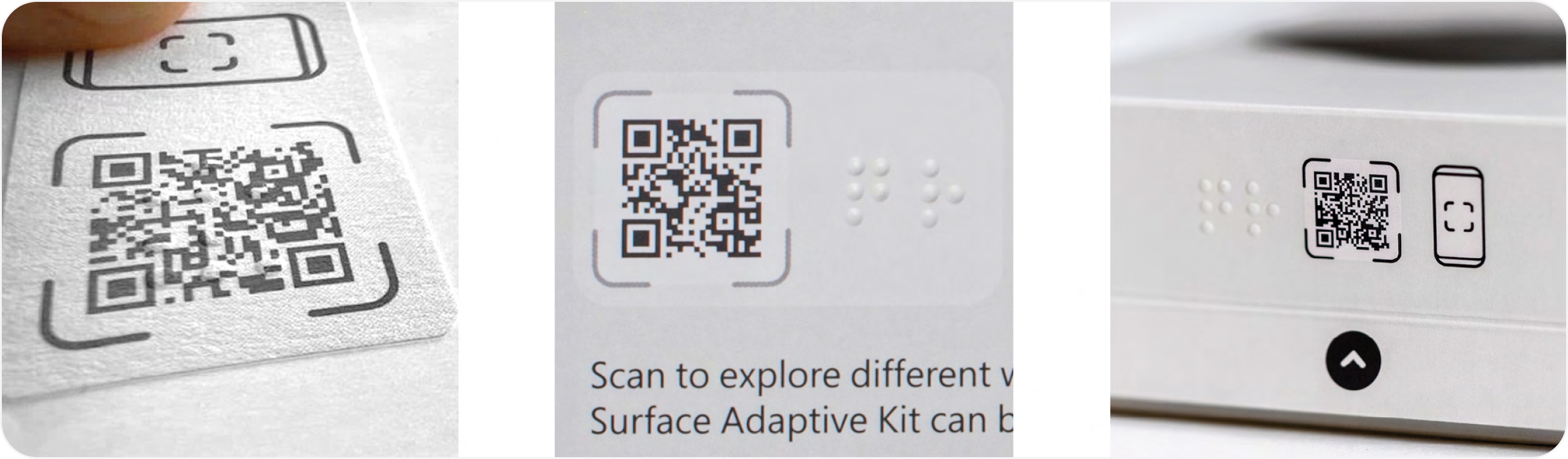
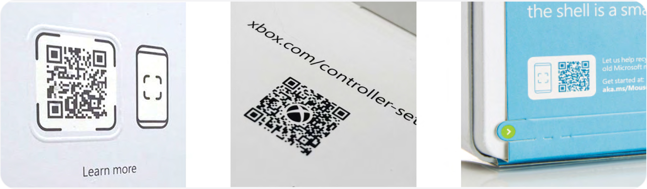
QR codes
The usefulness of QR codes for taking people online quickly is well understood. QR codes reduce friction by making it unnecessary to remember and type an actual URL. QR codes are even more useful to people who are blind or have low vision because the code be scanned without the need to “read” the packaging at all. At Microsoft, we have used braille to label QR codes, but even for blind and low-vision customers who don’t read braille, the raised dots provide a tactile signal that there is information worth exploring in the area.
Helpful hints
- Add a tactile clue to help people who are blind or have low vision to locate it.
- Include a text URL beside the QR to allow people without smart phones to still access the content.
- QR codes are intended to be scanned with a phone. Make sure the content on the other side of the code is formatted for the mobile experience.
Online extensions
Directing customers to online content from packaging offers many advantages, including the ability to provide more in-depth, detailed instructions than space limitations in the packaging will allow. Online extensions can provide content beyond static text and images, including videos and interactive content, and can support many more languages than will fit on a box. Providing content online can also reduce the materials required in the box which helps reduce packaging’s environmental impact.
Providing online equivalents to packaging content is also one of the best ways to provide accessible content to customers who are blind or have low vision. However, it is crucial that online content be formatted for accessibility. Many, many more resources for web accessibility can be found online; one place to start is the Web accessibility principles and guidelines.
Helpful hints
- Videos are a great way to provide instructions for products, but videos should always include captions and transcriptions for people with hearing disabilities as well as visual descriptions for people who are blind or have low vision.
- Videos and interactive widgets can be very useful, but the most accessible content is still a well formatted html page with correctly tagged images because it gives the most control to the user.
Measures
Where to begin
As mentioned, accessibility is a journey. But like any meaningful journey, being able to assess where you are on the path is not only helpful but can bring strategic focus to your efforts. To this end, Microsoft developed our Accessibility Evolution Model This model allows us to assess and track progress over time. Most importantly, it allows us to manage accessibility like a business with strategies, targets, and measurements. The model is broken into five levels.
Level 1 - Initial Early explorations are launched on ad hoc basis
Level 2 - Repeatable Work becomes more formalized and intentional
Level 3 - Defined Accessible design principles are codified and integrated from the start
Level 4 - Managed Measurements are in place to track progress
Level 5 - Optimized Maturity and experience leads to efficiencies and innovation
Our model is based on the study of existing best practices in maturity models, including the Carnegie Mellon Capability Model and the Level Access Digital Accessibility Maturity Model
These levels can be useful benchmarks for orienting where you are in your accessibility journey and foster critical and collaborative thinking about what you want to build as time goes on. They can help you set goals, engage with partners, galvanize colleagues and leaders, and give a team intent on accomplishing big things a sense of destination. Remember, there is no one-size-fits- all approach to creating a sustainable culture of accessibility. You’ll need to tailor your goals to fit the dynamics of your organization, inspire your people, and ultimately help embed inclusive deign thinking into your business.
We’ve found this construct useful in mapping our functional intent. For those excited to codify inclusive and accessible experiences into their work, we believe this model can be leveraged to good effect.
Metrics
Data is a powerful tool. It’s one thing to strive to create accessible packaging experiences, another thing to measure and understand progress over time. Data can highlight opportunities for improvement, illuminate patterns, and give creators a powerful lever on which to base change.
Some common measurements for packaging include usability, sustainability, and cost. In 2023, we added accessibility to our packaging metrics scorecard. Being able to score our packaging against a list of benchmarks allowed us to make informed decisions when comparing different design prototypes and to track our progress over time. Our list of benchmarks was compiled using our experience creating packaging for adaptive products, taking in feedback from the disabled community, and leveraging standards from other creative domains.
This list is a work in progress and continues to evolve. We recently added items derived from the Arthritis Foundation Ease of Use Rigid Packaging Guide for Boxes and Bags Please share your feedback and suggestions for other relevant measures to AccessiblePackaging@microsoft.com.
Accessible packaging checklist
In the end, data is only useful if used in meaningful ways. Establishing and socializing our accessible packaging metrics has helped us legitimize investment, improve our elemental tool kit, baseline innovative efforts, and most importantly provide a measures-based platform on which to continue to evolve our work.
In the end, data is only useful if used in meaningful ways. Establishing and socializing our accessible packaging metrics has helped us legitimize investment, improve our elemental tool kit, baseline innovative efforts, and most importantly provide a measures-based platform on which to continue to evolve our work.
What’s next
Sharing the journey
We began this guide by saying it was imperfect, and that we still have a lot to learn.
We decided at some point that we would not wait until we felt like we knew everything about accessibility to begin the work. We strongly believe that the impact of inclusive design transcends the product and people that make or use it. It’s a shift in mindset, and this shift can positively affect how we do things, our culture and how we define what matters.
There’s much to do. We can’t wait to continue to push forward, work with the community, ask questions, listen, and grow. As lifelong learners there’s no end to this journey. It’s our hope that by sharing our experiences that this guide might offer some inspiration for your accessible journey, and it’s also our hope that you’ll share as you go, too. Please get in touch and send us your feedback at AccessiblePackaging@ microsoft.com.
We look forward to having conversations with you.
Acknowledgements
Microsoft’s Packaging and Content team is deeply grateful for the support and encouragement we’ve received over the years. It takes a village to design, develop, engineer, and manufacture accessible packaging, and there are many talented and dedicated people we’re indebted to, both inside and outside of Microsoft. To those who have been a part of this adventure, we offer our heartfelt thanks.
Special thanks to our design guide authors, designers, and creators.

Joann Maisonet, Visual Design
Anna Perrella, Visual & Structural Design
Michael Zuberbier, Content Development
Fangyuan Chen, Visual Design
Kevin Marshall, Creative Direction